Swensons
30% higher revenue
21% decreased project cost
20% decreased square footage
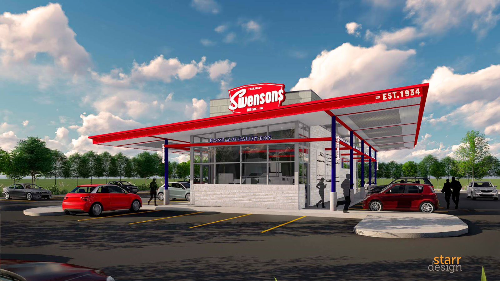
Based out of Akron, Ohio, Swenson’s had been in the business of flipping burgers and serving up milkshakes since 1934. They had a strong local following with seven locations under their belt. However, none of the locations looked the same and a new one hadn’t been built in 15 years. Swensons was purchased by a private equity firm and hired us to help develop a new prototype in 2016. This would include rebranding to embody the spirit of the founder and regional rollout preparation.
We strategized with Swenson’s through our Brand Discovery process by asking thoughtful questions to ignite deep thought and discussion on their brand personality, target customer, brand attributes, values and how they can differentiate themselves to be relevant to their target customer. This led to creating their Brand Architecture and clearly documenting their Brand Standards. The restaurant branding standards became the guide to creating a concept for team players focused on utmost quality and customer service in a fast-paced, nostalgic (not retro!) environment.
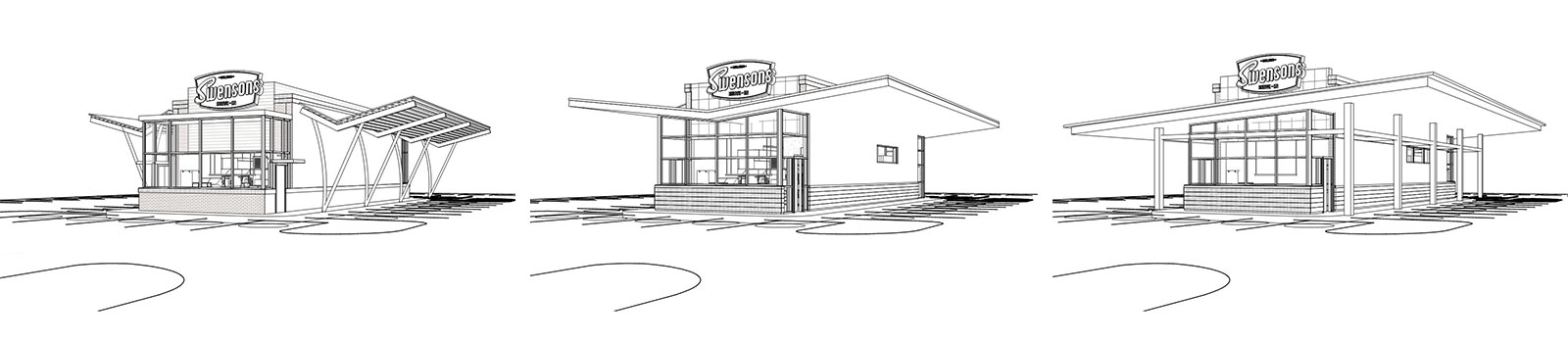
The operational analysis included walking through the kitchen and finding ways to make it more cost effective. We challenged the equipment they were using and their space utilization to come up with a plan that would decrease the kitchen square footage by 20%, tighten up the beverage program, redistribute smaller spaces to less commonly used services and allow them to staff up or down based on peak times. We tested our various restaurant design solutions by drawing them in 3-D, mocking them up in a warehouse-plywood kitchen and running staff through the processes. This provided excellent, real-life insight that would lead to the final, most efficient solution.
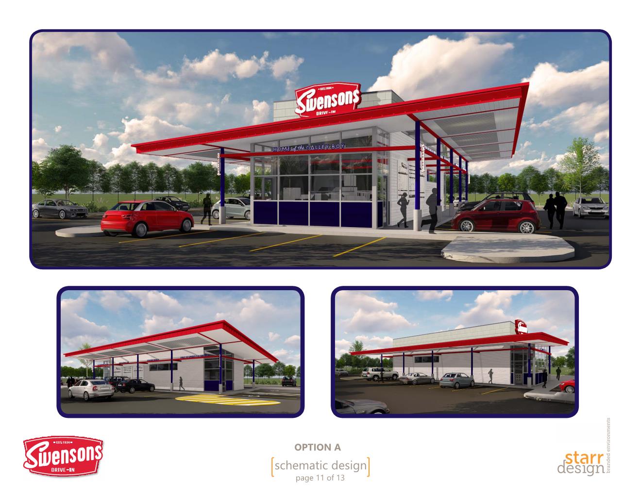
Staying aligned with Swenson’s vision was key during our restaurant design phase. We adjusted, tweaked, refined and tested over and over to come up with the standard canopy structure and color scheme, and made sure that we stuck close to the budget we began with at the project conception. This resulted in a holistic design that carries through in every facet of their brand – from the building, to packaging, to signage, to their website and to merchandizing. It’s a cool space that creates clarity for the customer seeking a convenient, high-quality yet affordable, nostalgic experience.
To ensure the brand’s intellectual property and construction would be easily recognizable, replicable and consistent in rolling out multiple locations, we created a Brand & Design Standards Manual and a set of fully coordinate Construction Documents. The Brand Standards were distributed throughout the corporate office and all of the stores to help employees feel more engaged and have ownership in the brand, thus increasing employee retention. The impact showed in gross earnings that were almost $2 million more than their previously highest earning store during the new prototype’s first year.
Since we’d put in the work up front, we figured out where we could afford to scale down without compromising key brand components and ended up saving nearly $250,000 on the next location. Using these standards, Swensons has rolled out 7 of our prototypes since 2017.